Yard cards are an excellent way to celebrate special occasions and events such as birthdays, graduations, and holidays. They can be used to convey a message or add a touch of color to your outdoor space. However, creating yard cards that are visually appealing and well-balanced can be challenging. In this post, we will discuss the art of balancing color and design in your yard cards.
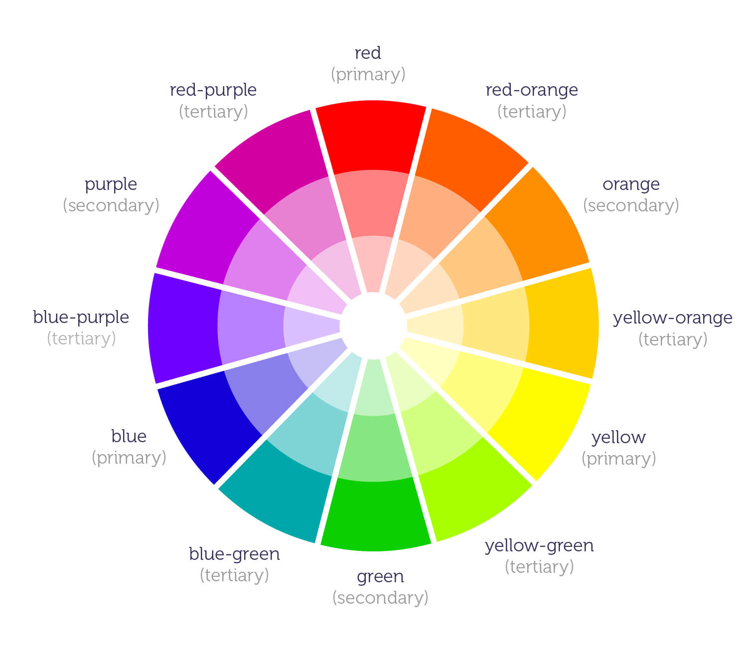
Understand the Color Wheel
The color wheel is a tool that artists and designers use to understand how colors work together. It consists of twelve colors, including primary, secondary, and tertiary colors. Primary colors are red, blue, and yellow, and they cannot be created by mixing other colors. Secondary colors are created by mixing two primary colors together. Tertiary colors are created by mixing a primary color with a secondary color.
Understanding the color wheel can help you choose colors that complement each other and create a harmonious design. For example, colors that are opposite each other on the color wheel, such as red and green, are complementary colors. Using these colors together can create a vibrant and eye-catching design.
Another way to use the color wheel is to choose colors that are adjacent to each other. These colors are called analogous colors, and they can create a soothing and calming effect when used together. For example, using shades of blue and green together can create a peaceful and serene design.
Use Complementary Colors
Complementary colors are colors that are opposite each other on the color wheel. Using complementary colors in your yard card display can create a bold and striking design. For example, using red and green together can create a festive and attention-grabbing design for the holiday season.
However, it is important to balance complementary colors with neutral colors such as black, white, or gray. Too much of a complementary color can be overwhelming and detract from the overall design. Adding a neutral color can help balance the design and create a more cohesive look.
Additionally, you can use different shades and tints of complementary colors to add depth and dimension to your design. For example, using a light shade of green with a dark shade of red can create a visually interesting design.
Add Contrast with Black and White
Black and white are not technically colors, but they can be used to add contrast and balance to your yard card display. Using black and white together can create a classic and timeless design. For example, using black text can create a clean and easy-to-read design.
Using black and white with a pop of color can also create a visually striking design. For example, using a black and white striped background with a bright yellow message can create a bold and attention-grabbing design.
Consider the Mood You Want to Create
The colors you choose for your yard card display can affect the mood and tone of your design. For example, using warm colors such as red, orange, and yellow can create a lively and energetic design. Using cool colors such as blue, green, and purple can create a calming and peaceful design.
It is important to consider the mood you want to create when choosing colors for your yard card display. For example, using soft pastel colors can create a romantic and whimsical design for a wedding, while using bright and bold colors can create a fun and playful design for a child's birthday party.
Balance Bold Colors with Neutral Ones
Using bold and bright colors can be a great way to create a visually striking design. However, it is important to balance these colors with neutral colors to create a cohesive and well-balanced design. Neutral colors such as black, white, and gray can help tone down the bright colors and create a more sophisticated look.
Another way to balance bold colors is to use them in smaller doses. For example, using a bright pink message on a white background can create a fun and playful design without overwhelming the viewer.
Choose a Focal Point
Choosing a focal point in your design can help create a sense of balance and harmony. A focal point is the main element in your design that draws the viewer's attention. It can be a message, image, or graphic that is larger or bolder than the other elements in the design.
When choosing a focal point, it is important to consider the overall design and message you want to convey. For example, if you are creating a yard card display for a graduation, the focal point could be the graduate's name or picture. This will create a sense of importance and celebration for the graduate.
Use Repetition to Create Unity
Using repetition in your design can create a sense of unity and cohesion. Repetition can be achieved through the use of color, pattern, or shape. For example, using the same color for the message and border can create a unified design.
Repetition can also be used to create a pattern or texture in your design. For example, using a repeating pattern of balloons, stars or hearts can create a whimsical and playful design. Using repetition can help tie the different elements of your design together and create a cohesive look.
Creating well-balanced and visually appealing yard card Display can be challenging, but by understanding the color wheel, using complementary colors, adding contrast with black and white, considering the mood you want to create, balancing bold colors with neutral ones, choosing a focal point, and using repetition to create unity, you can create a design that is both eye-catching and cohesive. By using these tips and techniques, you can create yard card displays that will make any occasion or event even more special. Be sure to visit Yard Card Planet, Your Home For Everything Yard Cards. We are available to chat with you on our website via Live Chat to answer any questions or to help with placing an order.